How BetterVoting reports a STAR result
Level: reference · deep dive
One line: BetterVoting (bettervoting.com) shows a live, visual result — interactive bar/pie charts plus "Race Details" tables — for the same STAR election the LH engine prints as text. Same method, same winner; a friendlier, less exhaustive view.
→ Hub: STAR Reporting · panel by panel: How to read a BetterVoting results page · the mapping in full: BetterVoting and the LH engine · the percentages: Runoff percentages.
What BetterVoting shows
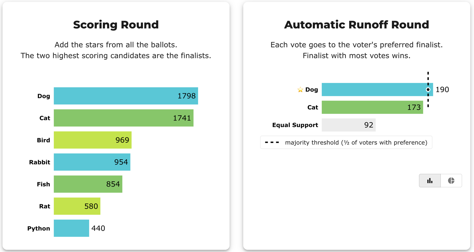
- Scoring Round — a bar chart of total stars; the top two bars are the finalists.
- Automatic Runoff — a chart with a toggle:
- bar view uses the all-voters numbers (e.g. 42 / 38 / 20) with a dashed majority-threshold line labelled "½ of voters with preference";
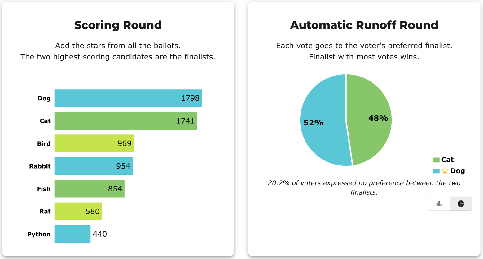
- pie view drops Equal Support and shows just the two finalists (52 / 48), footnoting the no-preference share.
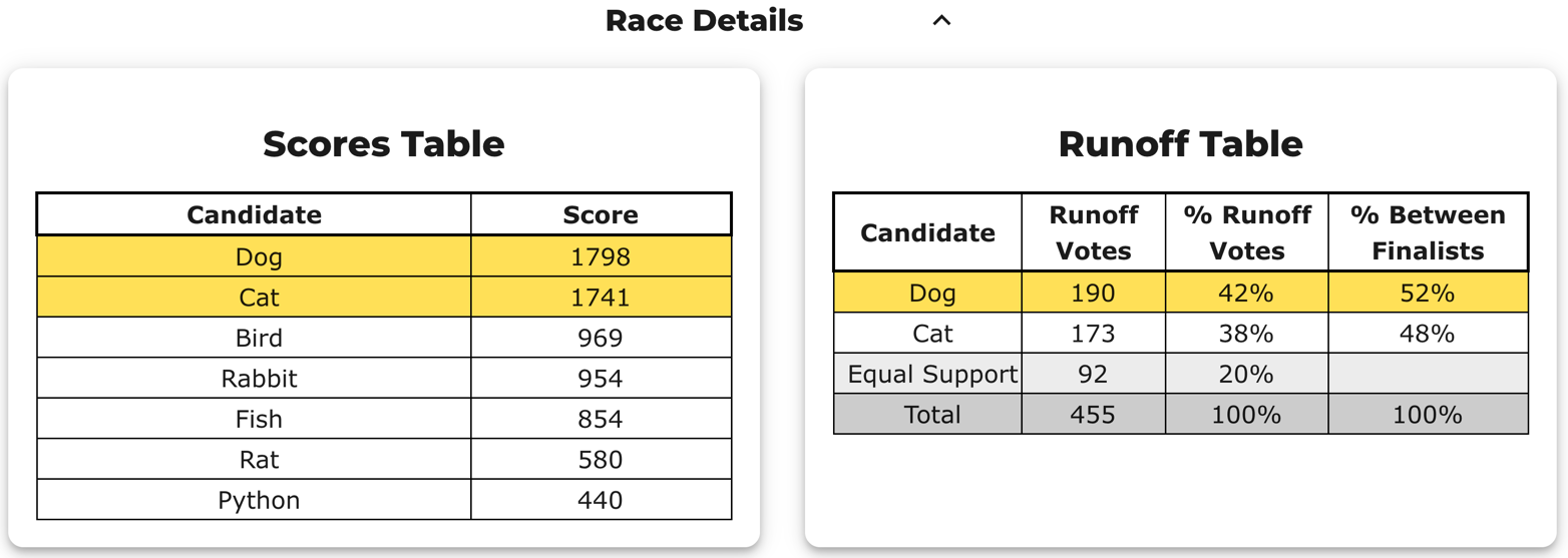
- Race Details tables — a Scores Table (the score totals) and a Runoff Table with two percent columns:
- % Runoff Votes — out of all ballots (includes the Equal Support share);
- % Between Finalists — out of only the voters with a preference. This is the column that decides the race. (Same idea, named: Runoff percentages.)
- Abstentions / tally — the result data carries
nAbstentionsandnTallyVotes. - Stats for Nerds — a second expander below Race Details, with a dropdown of analysis widgets. The dropdown is short and its contents change: as of 2026-08-06 a STAR race offers exactly four — Tabulation Steps, Distribution of Equal Support, Head-to-Head Matchups, Average Supporter Profile — verified on
qhjyr2andhckrf7. Panels this library has described in the past and that are not currently listed include Range of Scores (max − minper ballot), Column Distribution, Voter Error Stats, and a feature-flagged Name Recognition; check before assuming one is there (bv_result_screenshot.py <bvid> --list-panels). These are per-voter analyses; the LH engine's[Score Distribution]is the per-candidate one, and the two are not substitutes — see Two views of the same scores. What each panel actually means, and the denominator it uses: How to read a BetterVoting results page.
The screenshots (the pet race)
Scoring Round + Automatic Runoff bars — totals on the left; on the right each ballot's full vote goes to the higher-scored finalist, with the dashed majority-threshold line (½ of voters with a preference) that only the winner's bar crosses:
Race Details tables — the Scores Table and the Runoff Table, where the same 190 votes appear as two percentages: % Runoff Votes (out of all 455) and % Between Finalists (out of the 363 with a preference):
Pie view — the runoff toggled to drop Equal Support and show just the two finalists (52 / 48), footnoting the no-preference share:
(The same screenshots, walked through against the two denominators, are in Runoff percentages.)
One thing to watch: what BetterVoting calls an "abstention"
BetterVoting counts a ballot as an abstention when it is flat — every candidate scored the same — and excludes it from the tally. That includes an all-zeros ballot and an engaged ballot like all-5s or 3,3,3. The LH engine instead counts every cast ballot and treats only a blank ballot as an abstention, filing flat ballots under Equal Support. Same winner, different tally and score totals — see Where the two reports differ.
The same rule, one page over — "Range of Scores" (#1487)
The Stats for Nerds charts read the anonymized ballots directly, through a helper (ballotsForRace()) that drops only a truly blank ballot — i.e. LH's abstention rule, not BetterVoting's. So on an election with flat ballots the Range of Scores chart and the page headline divide by different numbers, and only one of them is printed. On hckrf7 the chart reads 33% / 67% (of 3 ballots) directly under the words "1 voters". Nothing is miscounted; the denominator is just invisible. Filed as Equal-Vote/bettervoting#1487.
A related display bug — the "Distribution of Equal Support" graph (#1390)
The same blank (null) vs explicit 0 distinction bit one of BetterVoting's Stats for Nerds charts. On the real CA Governor election gvdy42, the "Distribution of Equal Support" graph showed a single bar built from only 5 ballots, though the runoff correctly counted 124 equal-support. The widget compared raw scores, so ballots that skipped both finalists (null == null) and null-vs-0 ballots were silently dropped. Fixed by coercing skipped scores to 0 to match the tabulator — #1390 / PR #1431. The tabulator was always right; only the chart was wrong. (LH independently reproduces the 124: it reports 141 Equal Support = 124 + the 17 abstentions it folds in.)
Try it: bettervoting.com · help & FAQ · a real frozen result: pet race snapshot.